Category Archives: Posts

Illustrator Poems

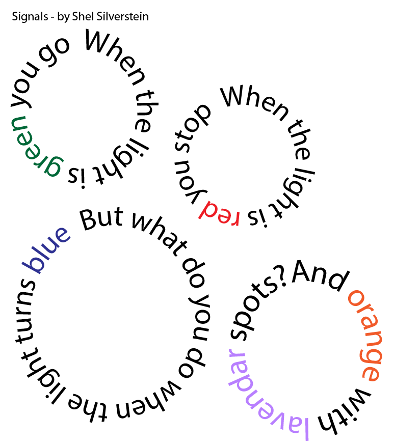
I chose a very simple poem by Shel Silverstein, and I interpreted it two different ways. In the first example, I am playing with text on a path, and color. I couldn’t figure out how to add a pattern to Illustrator. I probably chose the wrong color scheme again. I wanted to have the last word of the poem – “spots” – be spotted. Alas, this wasn’t meant to be. Still, I was able to draw the circles, get the text on the path, resize the text to fit, and add color to certain words of the text. Finally, I moved the circles around so that they were in order. 

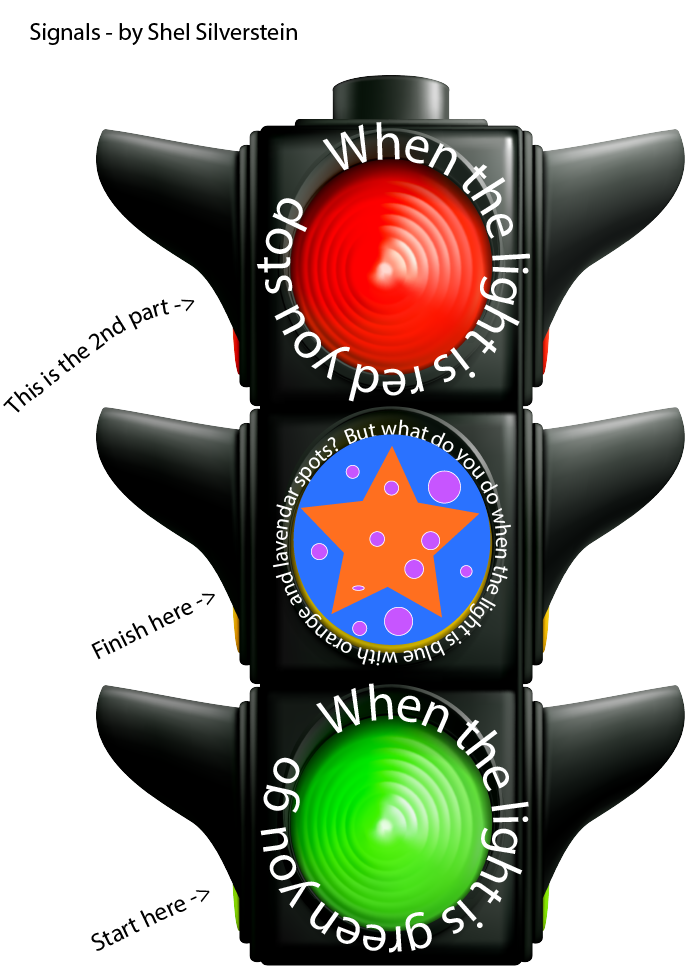
For my second version of the poem, I added a PNG of a stoplight. I then put the text on paths within the image, and I resized the text to fit around the lights. Next I changed the color of the middle light to fit the poem, added the orange star and lavender spots. I needed to give the audience some directions, however, as the stoplight image does not have the stanzas of the poem in order. If I was to do another version, I might use a different font for each word, or rebuild the poem with icons. I feel like Illustrator was more intuitive for me than Photoshop.

How Not to be Seen

I see how the film How Not to be Seen gets at some of the same concepts from the Violence at the Threshold of Detectability reading, with a lighter, satirical focus. It’s interesting to think about what can be hidden in a space the size of a pixel – 1’x1’ – in an aerial shot. The reading was exploring pixels in photos as it related to crimes of war, and while this film takes a broader approach, the calibration targets used throughout Hito Steyerl’s film do evoke the military, and the historic targets’ cracked, disintegrating surfaces create a current of uneasiness. 

I couldn’t quite figure out Hito Steyerl’s stance on being unseen. In the beginning, this didn’t seem to be an undesirable condition in the film, especially as voiceover was instructing the audience on how to attain this state. However, there were allusions to negative states of being unseen, such as being a woman over fifty – haha 🙁 and being an enemy of the state. It was helpful to watch the interview to realize that the artist views being unseen as an act of rebelling against all the surveillance in the world today, However, there seems to be a difference between choosing to be unseen, and being made unseen. One might purposefully escape through being invisible, but when you are made invisible, you are basically dead. 

Also, I didn’t get the Monty Python reference while initially watching this short film, but I see now how it has a similar absurd approach. I wouldn’t say that this video is funny, though. Humorous? I certainly didn’t laugh. I went back and watched the Monty Python short, and it feels much darker, after watching Steyerl’s film. It’s pretty violent! 

 In the interview, Hito Steyerl talks about how she began as a filmmaker with a strong technical background, and you can see that in this film. She has a mixture of digital special effects, and cinematic special effects.  I didn’t fully understand what a lot of the imagery was trying to say, and I didn’t know why the .MOV was significant in the title. I was also curious about her martial arts outfit in the beginning of the film. Is that another nod to the military?

Appropriated Images

I have a lot going on in my life right now, so I needed something fairly straightforward for this week’s homework. I chose to add famous portraits from DaVinci, Sargent, and Vermeer to well-known landscapes by Van Gogh. Many people take selfies in front of these Van Gogh paintings as they hang in museums all over the world, so I added in portraits, selfie-style. They are all women, in light of Women’s History Month! 🙂

Poster #1

This is a practical poster that I could actually use in my professional life. I used to make these in PowerPoint, which I am extremely comfortable with. Working in Photoshop is frustrating sometimes, because I know what I want to do, but I don’t yet have the vocabulary to look up tutorials on how to do many of the things that I want. This is imperfect, but I gave it my best shot:

Modern Design Analysis

I really enjoyed the videos, as I have no background in graphic design. In learning Graphic Design HIstory, I was most drawn to the Art Nouveau and the German Posters styles, even though they are very different. I feel inspired by nature, but I find clean, clear images with simple designs  to be restful to look at. It was interesting to learn about how graphic design style has evolved over time, but more practical for my purposes were the Foundations of Layout and Composition lectures. 

This billboard of the iPhone 12 has the iPhone on a diagonal, which creates tension for the viewer. There is a strong contrast between the gold/white/beige, and the black background. The sign is also balanced, with the text in opposite corners, making that magic “X” in the layout. The least important text is the smallest – “T-Mobile..” The selling point of the phone is its amazing camera, and that is centered on the billboard. 

This next image uses an unusual perspective to generate interest. We would never see the subject from this point of view in real life. The text grabs your attention with high contrast and a simple font. There is a small apple in the bottom left corner to balance out the apple on the phone. This ad also has a decent amount of negative space, which helps  it breathe for the viewer.

Both of these ads would be an example of the Bauhaus movement – Simple font, the images are not embellished or overly designed, real objects are used, and the overall look is balanced.

My IMA Experience

My main goal for the IMA MFA program is to complete a terminal degree. I have an MA in theatre, but I will need a terminal degree eventually to remain competitive in academia, and I didn’t want to do an MFA in acting, or a PhD in theatre.

I started teaching “Acting for the Camera” right out of undergrad because it was lucrative, and I needed to work. I bought myself a video camera, and I already had iMovie on my Mac. I learned iMove through trial and error, and I think I taught 3 different iterations of the same course at various local organizations. I would essentially make a short video each week with the kids, and at the end of the term we’d have a screening. I really enjoyed editing the videos, and when I came to NYU for graduate school, I kept making short films for class projects, etc. I found it very helpful to be able to create my own videos as a college professor, and now that higher ed is in a financial bind, I am also looking at transitioning to Ed Tech or something like that.

I really want to take a VR/360 Filmmaking course, but so far there are no plans to offer it again. VR is very similar to immersive theatre, which I love, and a lot of theatre companies started adding in a VR component back in 2018. After a strong start, VR has stalled, and I think we need some more innovation before it tips into mainstream.

So far, I have taken Doc 1, Premiere and Resolve workshops, Story Strategies, AR, and Doc Hist. Oh, and I took the undergrad version of Doc 1, the film history class, the introductory film production class, and the TV studio course.

I am hoping to leave Hunter College very familiar with the Adobe Creative Suite, and a body of creative work I could showcase. I am taking my sweet time to complete the program, though, so I’ll be around for awhile.

Some of my work includes:

Stop Motion (1 min) – https://vimeo.com/459910265

IMA Doc 1 Final Group Project (5ish mins) – https://vimeo.com/378007040

Undergrad Doc 1 Final Project (8.5 mins) https://vimeo.com/306586764

Undergrad Doc 1 Midterm Project (5ish mins) https://vimeo.com/304250350

Artists I Admire

TeamLab

This first one is a collective, founded back in early 2000. They are doing the most innovative work in projection-mapping design I have ever experienced. I’m going to do my presentation on them, so stay tuned!

CultureSpaces

This group also does projection mapping, with a historical/fine arts focus. They use music and motion to create a feeling of flowing through the exhibit. They are allegedly coming to NYC in 2022!

Cécile B. Evans

I like how her work integrates film, fine arts and architecture to create immersive spaces for the audience.