I really enjoyed the videos, as I have no background in graphic design. In learning Graphic Design HIstory, I was most drawn to the Art Nouveau and the German Posters styles, even though they are very different. I feel inspired by nature, but I find clean, clear images with simple designs to be restful to look at. It was interesting to learn about how graphic design style has evolved over time, but more practical for my purposes were the Foundations of Layout and Composition lectures.
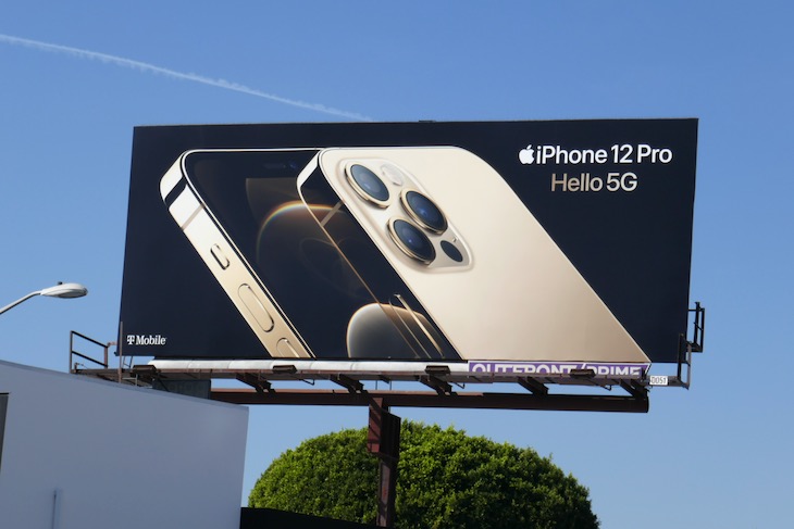
This billboard of the iPhone 12 has the iPhone on a diagonal, which creates tension for the viewer. There is a strong contrast between the gold/white/beige, and the black background. The sign is also balanced, with the text in opposite corners, making that magic “X” in the layout. The least important text is the smallest – “T-Mobile..” The selling point of the phone is its amazing camera, and that is centered on the billboard.
This next image uses an unusual perspective to generate interest. We would never see the subject from this point of view in real life. The text grabs your attention with high contrast and a simple font. There is a small apple in the bottom left corner to balance out the apple on the phone. This ad also has a decent amount of negative space, which helps it breathe for the viewer.
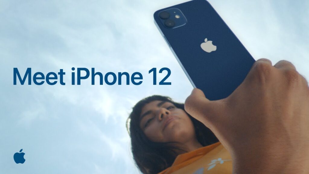
Both of these ads would be an example of the Bauhaus movement – Simple font, the images are not embellished or overly designed, real objects are used, and the overall look is balanced.

This entry is licensed under a Creative Commons Attribution-NonCommercial-ShareAlike 4.0 International license.